Intro to Addons
By default, Storybook comes with a way to list stories and visualize them. Addons implement extra features for Storybooks to make them more useful.
Basically, there are two types of addons. (Decorators and Native Addons)
1. Decorators
Decorators are wrapper components or Storybook decorators that wrap a story.
Wrapper Components
For example, let’s say we want to center a story rendered on the screen. For that, we can use a wrapper component like this:
const styles = {
  textAlign: 'center',
};
const Center = ({ children }) => (
  <div style={styles}>
    { children }
  </div>
);
Then we can use it when writing stories.
import { storiesOf } from '@storybook/react';
import { action } from '@storybook/addon-actions';

import Center from './center';
import Button from './button';

storiesOf('Button', module)
  .add('with text', () => (
    <Center>
      <Button onClick={action('clicked')}>Hello Button</Button>
    </Center>
  ));
Storybook Decorators
You can also expose this functionality as a Storybook decorator and use it like this.
import { storiesOf } from '@storybook/react';
import { action } from '@storybook/addon-actions';

import Button from './button';

const styles = {
  textAlign: 'center',
};
const CenterDecorator = (storyFn) => (
  <div style={styles}>
    { storyFn() }
  </div>
);

storiesOf('Button', module)
  .addDecorator(CenterDecorator)
  .add('with text', () => (
    <Button onClick={action('clicked')}>Hello Button</Button>
  ))
  .add('with some emojies', () => (
    <Button onClick={action('clicked')}><span role="img" aria-label="so cool">😀 😎 👍 💯</span></Button>
  ));
You can also add a decorator globally for all stories like this:
import { storiesOf, addDecorator } from '@storybook/react';
import { action } from '@storybook/addon-actions';
import { linkTo } from '@storybook/addon-links';

import Button from './button';
import Welcome from './welcome';

const styles = {
  textAlign: 'center',
};
const CenterDecorator = (storyFn) => (
  <div style={styles}>
    { storyFn() }
  </div>
);
addDecorator(CenterDecorator);

storiesOf('Welcome', module)
  .add('to Storybook', () => (
    <Welcome showApp={linkTo('Button')}/>
  ));

storiesOf('Button', module)
  .add('with text', () => (
    <Button onClick={action('clicked')}>Hello Button</Button>
  ))
  .add('with some emojies', () => (
    <Button onClick={action('clicked')}><span role="img" aria-label="so cool">😀 😎 👍 💯</span></Button>
  ));
You can call
addDecorator()inside the story definition file as shown above. But adding it to the Storybook config file is a much better option.
2. Native Addons
Native addons use Storybook as a platform and interact with it. Native addons can add extra features beyond wrapping stories.
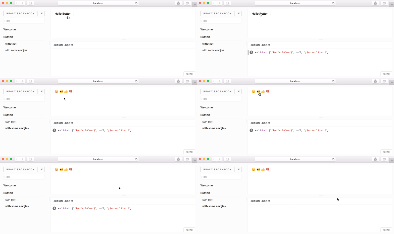
For example, storybook-actions is such an addon.

It will allow you to inspect the parameters of any event of your components.
See the following links to learn more about native addons: