
Writing Addons
This is a complete guide on how to create addons for Storybook.
Storybook Basics
Before we begin, we need to learn a bit about how Storybook works. Basically, Storybook has a Manager App and a Preview Area.
Manager App is the client side UI for Storybook. Preview Area is the place where the story is rendered. Usually the Preview Area is an iframe.
When you select a story from the Manager App, the relevant story is rendered inside the Preview Area.
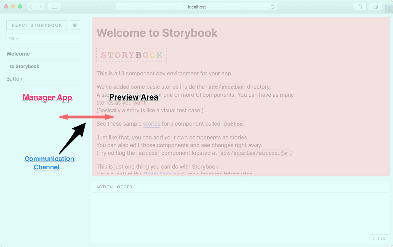
As shown in the above image, there’s a communication channel that the Manager App and Preview Area use to communicate with each other.
Capabilities
With an addon, you can add more functionality to Storybook. Here are a few things you could do:
- Add a panel to Storybook (like Action Logger).
- Interact with the story and the panel.
- Set and get URL query params.
- Select a story.
- Register keyboard shortcuts (coming soon).
With this, you can write some pretty cool addons. Look at our Addon gallery to have a look at some sample addons.
Getting Started
Let’s write a simple addon for Storybook. It’s a Notes addon on which you can display some notes for a story.
Just for the simplicity, we’ll write the addon right inside our app. But we can easily move it into a separate NPM module.
How it looks
We write a story for our addon like this:
import React from 'react';
import { storiesOf } from '@storybook/react';
import { action } from '@storybook/addon-actions';
import withNotes from '../notes-addon';
import Button from './Button';
storiesOf('Button', module)
.addDecorator(withNotes)
.add('with text', () => <Button onClick={action('clicked')}>Hello Button</Button>, {
notes: 'This is a very simple Button and you can click on it.',
})
.add(
'with some emoji',
() => (
<Button onClick={action('clicked')}>
<span role="img" aria-label="so cool">
😀 😎 👍 💯
</span>
</Button>
),
{ notes: 'Here we use some emoji as the Button text. Doesn't it look nice?' }
);
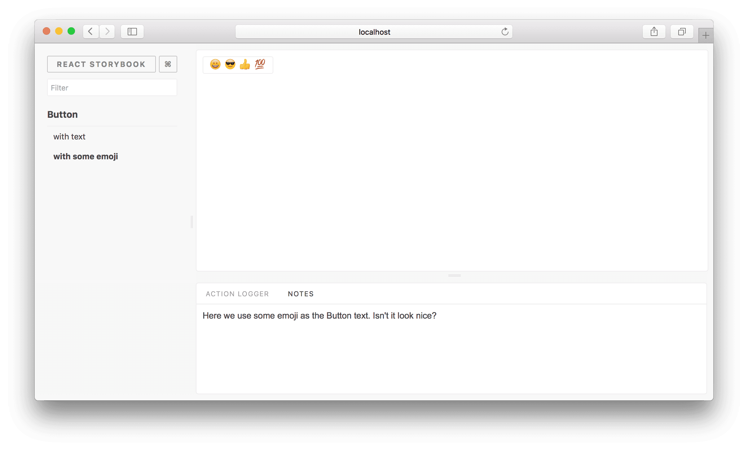
Then it will appear in the Notes panel like this:
To avoid having addons show up at the same time as each other, each addon should be aware of the active prop sent by Storybook and only render addon when active is true.
render: ({ active }) => <Notes channel={channel} api={api} active={active} />,
Setup
First, create an addons.js inside the Storybook config directory and add the following content to it.
// Register the actions addon that we used above
import '@storybook/addon-actions/register';
We’ll use this file shortly to register the Notes addon we are building.
Now we need to create two files, register.js and index.js, inside a directory called src/notes-addon.
The Addon
Let’s add the following content to the index.js. It will expose a decorator called withNotes which we use the .addDecorator() API to decorate all our stories.
The @storybook/addons package contains a makeDecorator function which we can easily use to create such a decorator:
import React from 'react';
import addons, { makeDecorator } from '@storybook/addons';

export withNotes = makeDecorator({
  name: 'withNotes',
  parameterName: 'notes',
  // This means don't run this decorator if the notes decorator is not set
  skipIfNoParametersOrOptions: true,
  wrapper: (getStory, context, {parameters}) => {
    const channel = addons.getChannel();

    // Our simple API above simply sets the notes parameter to a string,
    // which we send to the channel
    channel.emit('MYADDON/add_notes', parameters);

    return getStory(context);
  }
})
In this case, our component can access something called the channel. It lets us communicate with the panel (where we display notes). It has a NodeJS EventEmitter compatible API.
In the above case, it will emit the notes’ text to the channel, so our panel can listen to it.
Then add the following code to the register.js.
import React from 'react';
import addons from '@storybook/addons';
import styled from '@emotion/styled';

const NotesPanel = styled.div({
  margin: 10,
  width: '100%',
  overflow: 'auto',
});

class Notes extends React.Component {
  state = {
    text: '',
  };

  onAddNotes = text => {
    this.setState({ text });
  };

  componentDidMount() {
    const { channel, api } = this.props;
    // Listen to the notes and render it.
    channel.on('MYADDON/add_notes', this.onAddNotes);

    // Clear the current notes on every story change.
    this.stopListeningOnStory = api.onStory(() => {
      this.onAddNotes('');
    });
  }

  render() {
    const { text } = this.state;
    const { active } = this.props;
    const textAfterFormatted = text ? text.trim().replace(/\n/g, '<br />') : '';

    return active ? <NotesPanel dangerouslySetInnerHTML={{ __html: textAfterFormatted }} /> : null;
  }

  // This is some cleanup tasks when the Notes panel is unmounting.
  componentWillUnmount() {
    if (this.stopListeningOnStory) {
      this.stopListeningOnStory();
    }

    this.unmounted = true;
    const { channel, api } = this.props;
    channel.removeListener('MYADDON/add_notes', this.onAddNotes);
  }
}

// Register the addon with a unique name.
addons.register('MYADDON', api => {
  // Also need to set a unique name to the panel.
  addons.addPanel('MYADDON/panel', {
    title: 'Notes',
    render: ({ active }) => <Notes channel={addons.getChannel()} api={api} active={active} />,
  });
});
It will register our addon and add a panel. In this case, the panel represents a React component called Notes. That component has access to the channel and storybook api.
Then it will listen to the channel and render the notes text on the panel. Have a look at the above annotated code.
In this example, we are only sending messages from the Preview Area to the Manager App (our panel). But we can do it the other way around as well.
It also listens to another event, called onStory, in the storybook API, which fires when the user selects a story. We use that event to clear the previous notes when selecting a story.
Multiple addons can be loaded, but only a single panel can be shown, the render function will receive an active prop, which is true if the addon is shown. It is up to you to decide if this mean your component must be unmounted, or just visually hidden. This allows you to keep state but unmount expensive renderings.
Register the addon
Now, finally, we need to register the addon by importing it to the .storybook/addons.js file.
// Register the actions addon that we used above
import '@storybook/addon-actions/register';

// Our addon
import '../src/MYADDON/register';
Above code runs in the Manager App but not in the preview area.
That’s it. Now you can create notes for any story as shown below:
import React from 'react';
import { storiesOf } from '@storybook/react';
import { action } from '@storybook/addon-actions';
import withNotes from '../notes-addon';
import Button from './Button';
storiesOf('Button', module)
.addDecorator(withNotes)
.add('with text', () => <Button onClick={action('clicked')}>Hello Button</Button>, {
notes: 'This is a very simple Button and you can click on it.',
})
.add(
'with some emoji',
() => (
<Button onClick={action('clicked')}>
<span role="img" aria-label="so cool">
😀 😎 👍 💯
</span>
</Button>
),
{ notes: 'Here we use some emoji as the Button text. Doesn't it look nice?' }
);
Styling your addon
We use emotion for styling, AND we provide a theme which can be set by the user!
We highly recommend you also use emotion to style your components for storybook, but it’s not a requirement. You can use inline styles or another css-in-js lib. You can receive the theme as a prop by using the withCSSContext hoc from emotion. Read more about theming.
Re-using existing components
Wouldn’t it be awesome if we provided you with some common used components you could use to build out your own addon quickly and fit in right away?
Good news! WE DO! We publish most of storybook’s UI components as a package: @storybook/components. You can check them out in our storybook (pretty meta right?).
Addon API
Here we’ve only used a few functionalities of our Addon API. You can learn more about the complete API here.
Packaging
You can package this addon into a NPM module very easily. As an example, have a look at this package.
In addition to moving the above code to a NPM module, we’ve set react and @storybook/addons as peer dependencies.
Local Development
When you are developing your addon as a package, you can’t use npm link to add it to your project. Instead add your package as a local dependency into your package.json as shown below:
{
  "dependencies": {
    "@storybook/addon-notes": "file:///home/username/myrepo"
  }
}
Package Maintenance
Your packaged Storybook addon needs to be written in ES5. If you are using ES6, then you need to transpile it.
