Typescript Config
This is a central reference for using Storybook with Typescript.
Dependencies you may need
yarn add -D typescript
yarn add -D awesome-typescript-loader
yarn add -D @types/storybook__react # typings
yarn add -D @storybook/addon-info react-docgen-typescript-webpack-plugin # optional but recommended
yarn add -D jest "@types/jest" ts-jest #testing
We have had the best experience using awesome-typescript-loader, but other tutorials may use ts-loader, just configure accordingly. You can even use babel-loader with a ts-loader configuration.
Setting up Typescript to work with Storybook
We first have to use the custom Webpack config in full control mode, extending default configs by creating a webpack.config.js file in our Storybook configuration directory (by default, it’s .storybook):
const path = require('path');
const TSDocgenPlugin = require('react-docgen-typescript-webpack-plugin');
module.exports = (baseConfig, env, config) => {
  config.module.rules.push({
    test: /\.(ts|tsx)$/,
    loader: require.resolve('awesome-typescript-loader'),
  });
  config.plugins.push(new TSDocgenPlugin()); // optional
  config.resolve.extensions.push('.ts', '.tsx');
  return config;
};
The above example shows a working Webpack config with the TSDocgen plugin also integrated; remove the optional sections if you don’t plan on using them.
tsconfig.json
{
  "compilerOptions": {
    "outDir": "build/lib",
    "module": "commonjs",
    "target": "es5",
    "lib": ["es5", "es6", "es7", "es2017", "dom"],
    "sourceMap": true,
    "allowJs": false,
    "jsx": "react",
    "moduleResolution": "node",
    "rootDirs": ["src", "stories"],
    "baseUrl": "src",
    "forceConsistentCasingInFileNames": true,
    "noImplicitReturns": true,
    "noImplicitThis": true,
    "noImplicitAny": true,
    "strictNullChecks": true,
    "suppressImplicitAnyIndexErrors": true,
    "noUnusedLocals": true,
    "declaration": true,
    "allowSyntheticDefaultImports": true,
    "experimentalDecorators": true,
    "emitDecoratorMetadata": true
  },
  "include": ["src/**/*"],
  "exclude": ["node_modules", "build", "scripts"]
}
This is for the default configuration where /stories is a peer of src. If you have them all in just src you may wish to replace "rootDirs": ["src", "stories"] above with "rootDir": "src",.
Import tsx stories
Change config.ts inside the Storybook config directory (by default, it’s .storybook) to import stories made with Typescript:
// automatically import all files ending in *.stories.js
const req = require.context('../stories', true, /.stories.tsx$/);

function loadStories() {
  req.keys().forEach(req);
}

configure(loadStories, module);
Using Typescript with the TSDocgen addon
The very handy Storybook Info addon autogenerates prop tables documentation for each component, however it doesn’t work with Typescript types. The current solution is to use react-docgen-typescript-loader to preprocess the Typescript files to give the Info addon what it needs. The webpack config above does this, and so for the rest of your stories you use it as per normal:
import * as React from 'react';
import { storiesOf } from '@storybook/react';
import { action } from '@storybook/addon-actions';
import TicTacToeCell from './TicTacToeCell';

const stories = storiesOf('Components', module);

stories.add(
  'TicTacToeCell',
  () => <TicTacToeCell value="X" position={{ x: 0, y: 0 }} onClick={action('onClick')} />,
  { info: { inline: true } }
);
Customizing Type annotations/descriptions
Please refer to the react-docgen-typescript-loader docs for writing prop descriptions and other annotations to your Typescript interfaces.
Additional annotation can be achieved by setting a default set of info parameters:
// Globally in your .storybook/config.js, or alternatively, per-chapter
addDecorator({
  styles: {
    header: {
      h1: {
        marginRight: '20px',
        fontSize: '25px',
        display: 'inline',
      },
      body: {
        paddingTop: 0,
        paddingBottom: 0,
      },
      h2: {
        display: 'inline',
        color: '#999',
      },
    },
    infoBody: {
      backgroundColor: '#eee',
      padding: '0px 5px',
      lineHeight: '2',
    },
  },
  inline: true,
  source: false,
});
This can be used like so:
import * as React from 'react';

import { storiesOf } from '@storybook/react';
import { PrimaryButton } from './Button';
import { text, select, boolean } from '@storybook/addon-knobs/react';

storiesOf('Components/Button', module).addWithJSX(
  'basic PrimaryButton',
  () => (
    <PrimaryButton
      label={text('label', 'Enroll')}
      disabled={boolean('disabled', false)}
      onClick={() => alert('hello there')}
    />
  ),
  {
    info: {
      text: `

  ### Notes

  light button seen on <https://zpl.io/aM49ZBd>

  ### Usage
  ~~~js
  <PrimaryButton
    label={text('label', 'Enroll')}
    disabled={boolean('disabled',false)}
    onClick={() => alert('hello there')}
  />
  ~~~

`,
    },
  }
);
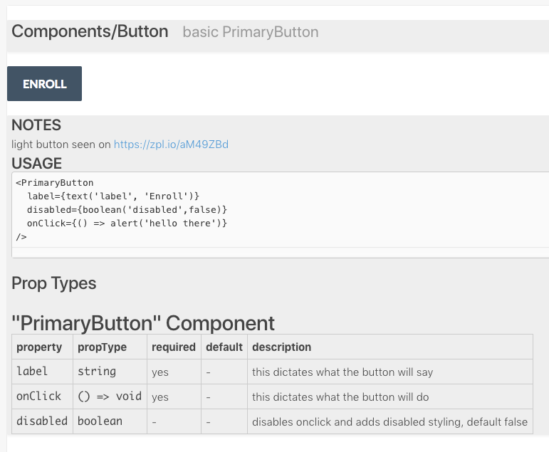
And this is how it looks:

Note: Component docgen information can not be generated for components that are only exported as default. You can work around the issue by exporting the component using a named export.
Setting up Jest tests
The ts-jest README explains pretty clearly how to get Jest to recognize TypeScript code.
This is an example jest.config.js file for jest:
module.exports = {
    transform: {
        ".(ts|tsx)": "ts-jest",
    },
    testPathIgnorePatterns: ["/node_modules/", "/lib/"],
    testRegex: "(/test/.*|\\.(test|spec))\\.(ts|tsx|js)$",
    moduleFileExtensions: ["ts", "tsx", "js", "json"],
};
Building your Typescript Storybook
You will need to set up some scripts - these may help:
  "scripts": {
    "start": "react-scripts-ts start",
    "build": "npm run lint && npm run build-lib && build-storybook",
    "build-lib-watch": "tsc -w",
    "build-lib": "tsc && npm run copy-css-to-lib && npm run copy-svg-to-lib && npm run copy-png-to-lib && npm run copy-woff2-to-lib",
    "test": "react-scripts-ts test --env=jsdom",
    "test:coverage": "npm test -- --coverage",
    "eject": "react-scripts-ts eject",
    "storybook": "start-storybook -p 6006",
    "build-storybook": "build-storybook",
    "copy-css-to-lib": "cpx \"./src/**/*.css\" ./build/lib",
    "copy-woff2-to-lib": "cpx \"./src/**/*.woff2\" ./build/lib",
    "copy-svg-to-lib": "cpx \"./src/**/*.svg\" ./build/lib",
    "copy-png-to-lib": "cpx \"./src/**/*.png\" ./build/lib",
    "lint": "tslint -c tslint.json 'src/**/*.{ts,tsx}'"
  },